- Use the figure/ ground relationship to change the degree of activity in the design
- During my design process, I want to work on taking the time to move shapes and objects around to make both simple and complex images. I want to practice using space and size to change the degree of activity in my design.
- Interaction between shapes creates unique relationships
- Rather than having shapes separated from each other, I want to try and connect shapes to help communicate my message. I need to pay attention to how certain shapes interact together and how it influences the overall image.
- Using proportional systems to create relationships between shapes
- I want to use proportional systems to create shapes but understand where the balance is between my image being proportional and static or proportional and dynamic.
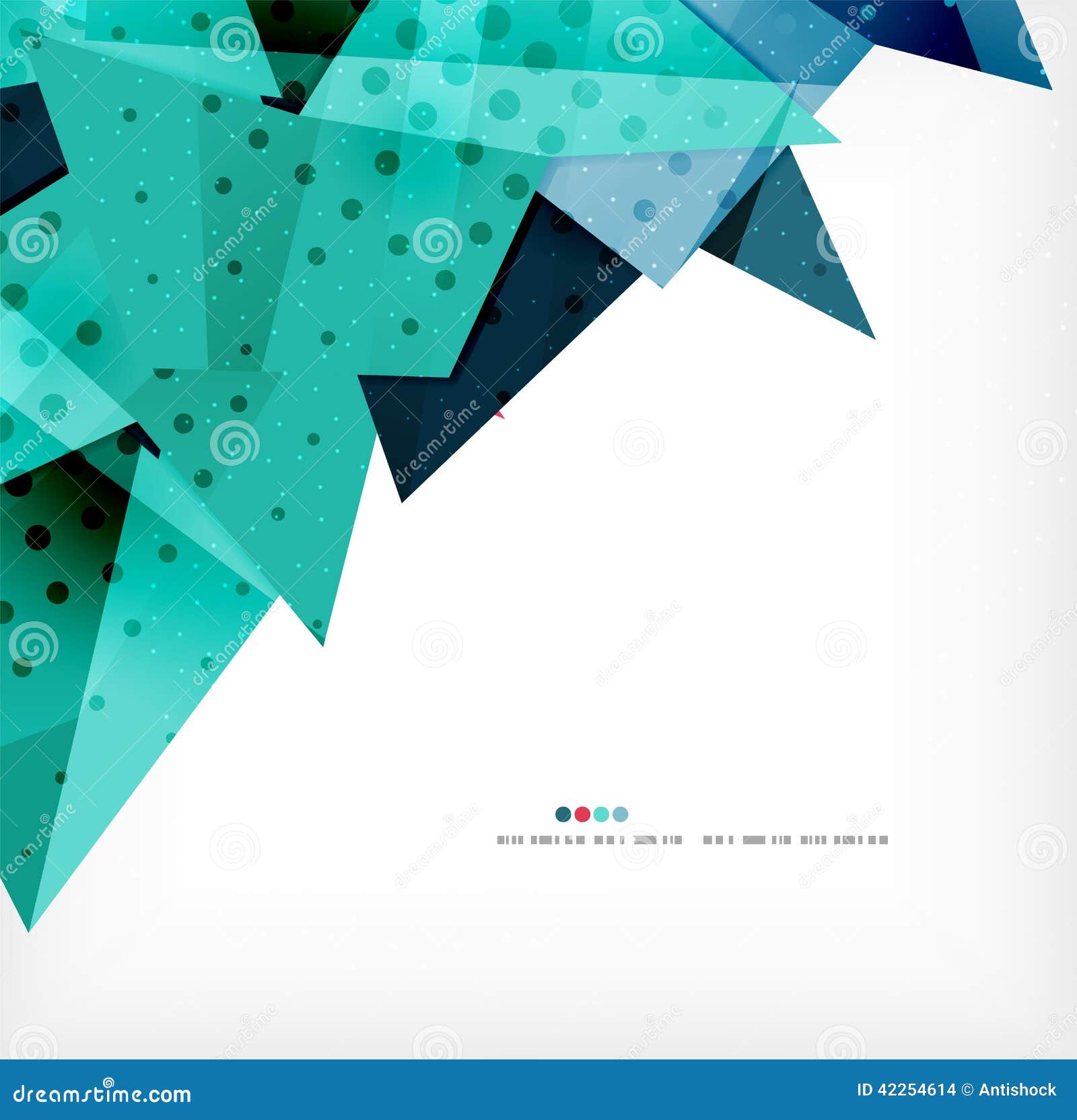
- Creating contrast/”tension” with shapes
- As I am designing, I want to work on creating tension with shapes rather than just with colors. I want to use triangles, squares, and circles that interact with each other and create a dynamic image.
- Breaking space to create a dynamic interaction between positive and negative space
- Using both small and large images I want to use positive space that interacts with the negative space. As I go through the design process, I want to find the best form of interaction that communicates my message.
- Arranging forms to create meaning
- I want to use the arrangement of shapes and images to create movement. Specifically, I want to focus on using distance between images on the y, x, and z axis.
- Activating space by not blocking the movement of the eye
- As I create my designs, I want to make sure that I easily draw my viewer’s eyes to the focus without blocking movement by my placement of lines and shapes. I want to work on using lines to create movement rather than to block the movement of the image.
- Creating emphasis through clustering
- Rather than using color and size to create emphasis, I want to practice creating focus points by shortening the distance between shapes and images in my design. I want to use negative space to draw the viewer’s attention towards the cluster.
- Cerating meaning by making forms different or similar to each other
- As I go through the design process, I want to be more aware of why I am making elements the same size, color or shape. While I’m in the design process, I want to adjust my thinking to see the importance of both similar and different objects.
- Making the composition “resolved” by making the purpose of each element clear
- Although I understand how to create purpose in my design, I also want to be more intentional about making it easy for my audience to understand the purpose.
Journal #1
Journal #1: form & space
- Clarity & Decisiveness
- Creating clear, accessible visual messages is something I strive to do with my process.
- Plane and Mass
- I don’t normally play with plane and mass unless with text, if I’m creating a drop shadow. I haven’t had enough experience to play with the dimensions of the design I create.
- Surface Activity
- Textures and patterns I stay away from as well, when done right they can look good but they seem very time consuming and you have to pay close attention to detail.
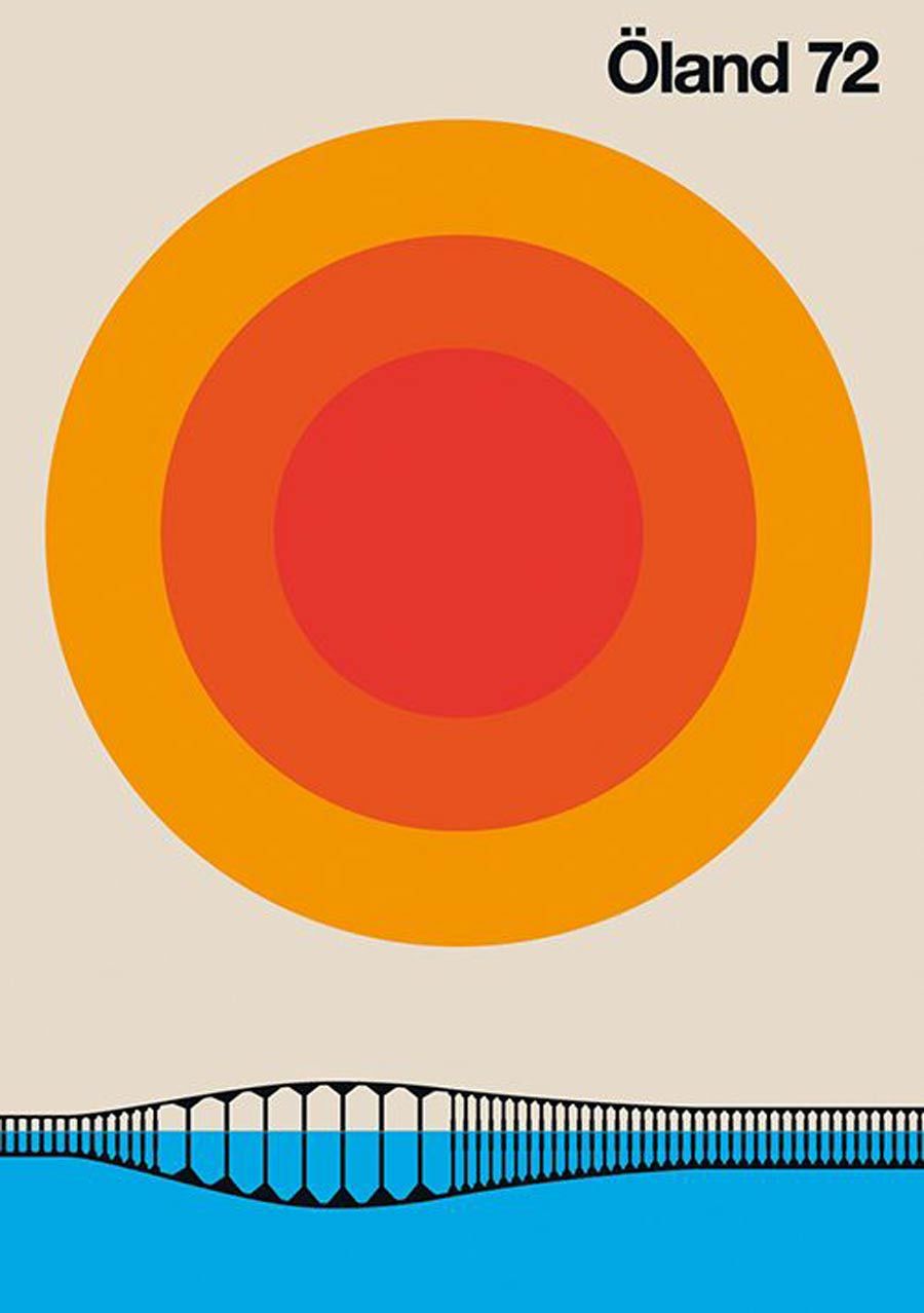
- Static vs. Dynamic
- We talked about this last week in trying to figure out what makes something static or dynamic. It all comes down to the proportions of positive and negative. The picture plane is already flat, and movement and depth must be created as an illusion.
- Breaking Space
- Space is neutral and inactive until it is broken by a form. Breaking the space means engaging the viewer, and transmitting important messages both literal and conceptual. I’ve never thought about the space as something that needs to be broken, but filled.
- Arranging Form
- Creating relationships among the forms, between the forms and in the surrounding space generates messages for the viewer and between themselves.
- Symmetry
- Asymmetrical arrangements provoke more rigorous involvement, while symmetrical arrangements can cause the viewer to not investigate any further. I don’t really know how this affects my design process because I don’t intentionally play with symmetry or asymmetry but I thought it was interesting.
- Activating Space
- Focusing the majority of visual activity into one area of a composition is an excellent way of creating emphasis and a contrasting area for rest. This can also cause other space to feel inactive.
- Proportion
- This is all about controlling the eye’s movement through, and creating harmonic relationships among form elements.
- Identity & Difference
- Creating comparisons between groupings of form or among parts within a group is identity. I like toying with identity and difference so the components don’t look identical but they look like they belong.
categories of form


Categories of Form
- The Dot

2. The Line

3. The Plane (& Mass)
4. Geometric Form

5. Organic Form

6. Surface Activity

Chapter 1. Reading Notes
1. The Shape of Space
- The shape of space is the size of the format space comparing with the to the form within.
2. Positive and Negative
- A positive element would be a solid object or thing, and a negative element is the absence or opposite form.
3. Clarity and Decisiveness
- The point, is to understand what kind of message is being carried in the given form, what it does in the space, and what effect the combination of aspect has on the viewer.
4. The Dot
- The dot is a point of focused attention that simultaneously contracts inward and radiates outward.
5. The Line
- The line unites areas within a composition, and is defined by the pulling effect on space between two dots.
6. Plane and Mass
- A plane is just a big dot with outer contour, the sense of the shape becomes an important attribute. The relative size and simplicity of the shape has an impact on its perceived mass, or weight.
7. Organic Form
- Shapes that are irregular, complex, and highly differentiated are considered organic, our brains tell us this after millennia of seeing organic forms all around us in nature.
8. Breaking Space
- The resulting breach of emptiness creates a new space, making the areas surrounding the form.
9. Symmetry and Asymmetry
- Symmetry is a compositional state in which the arrangement of forms responds to the central axis of the format, asymmetry requires the brain to assess differences in space and stimulate the eye to greater movement.
10. Compositional Contrast
- Areas that contrast with each other is inherent in designing a well-resolved dynamic composition. Contrast applies to specific relationships such as light versus dark.
Categories of Form
1. The Dot

2. The Line

3. The Plane (& Mass)


4. Geometric Form
5. Organic Form

6. Surface Activity
Reading Notes Chapter 1
1. The Shape of Space
- The size and shape of space in a picture changes how we perceive form. By changing the size of a format, I can learn to change the apparent size of elements in my design processes.
2. Positive and Negative
- The form of a picture is considered a positive element while the space of the picture is considered negative. By learning the relationships between positive form and negative space, I can convey the appropriate message desired from my designs.
3. Clarity and Decisiveness
- An image must be readily understandable (clarity). It must be obvious that it is one thing and not another (decisiveness). This can change my design process by encouraging me to make sure my works are obvious in what they are and understandable.
4. The Dot
- A dot is a point of attention that anchors itself to any space it resides. No matter what the space is, it is still a dot. By learning about the nature of the dot, I can gain a better feeling for what my work will be.
5. The Line
- The line unites areas together in a composition. They are inherently dynamic and perform functions like separating space and enclosing objects. By learning about the functions of lines, I can gain a greater understanding of how they control space.
6. Plane and Mass
- A plane is a dot with its outer contour containing an important attribute (ex: angular instead of round). All form have a perceived mass that changes based on the size and simplicity of a shape. By learning about the important of mass and the attributes of planes, I can give my works a true sense of texture and weight.
7. Geometric Form
- A form with a regularized contour is geometric. These forms are often angular and perceived as artificial. By adding geometric forms to my works, I can create a feeling of ambiguity of unease.
8. Organic Form
- A form that irregular or textured is organic in nature. These forms are often seen as soft and naturally occurring as opposed to geometric forms being artificial. By using organic forms in my works, I can help create a sense of familiarity.
9. Surface Activity
- Surface activity helps viewers differentiate forms from each other. By grouping dots together, we create the illusion of activity through texture and pattern. By learning the importance of texture and pattern in surface activity, I can make my images come alive.
10. Static and Dynamic
- A image that has little movement might be considered static. On the other hand, an image that contains perceived movement might be considered dynamic. Learning the importance of rest and movement can help me to really bring out the purpose in my images.
My Design Process
1) pick colors on purpose
– This is important because If I just put a bunch of different colors together it doesn’t make sense. Colors can bring certain emotions or meanings. I think this is important because I don’t want to add just random colors together.
2) negative space is magical – create it don’t just fill it up
– This will help me when I want show and define a object. I never really thought about how negative space affects an object. When it comes to negative space it Is important to notice that it any art that is created.
3) if you can do it with less then do it.
– I have learned that you don’t need to put so much stuff. It can be simple and still portray a message or have meaning to it.
4) be universal that its not about you
-I learned that you need to remember it is not always about you. For example, You are trying to get people to go to a certain event like a festival. I need to focus on what the event is for and what the audience should and like to see. I need to realize that most of the time it is for an audience and telling a message.
5) be decisive do it on purpose or don’t do it at all
-This is a struggle for me because I am indecisive. I will like one thing for a moment and then want to change it up again. I have to learn to make clear decisions. I don’t want to show that I am not confident in my work. I want to show that I can do the work and have the audience believe in me.
6) create images don’t scavenge
-What I got from this was that I shouldn’t just rely on images such as stock photos. If I am going to use a certain type of image I should change it up and transform to how the client would want it to be. I feel like what this means is that it is alright to use an image but my own style to it by adding more details and certain things to it. I should customize so it looks different than the original image.
7) Use two typefaces families maximum
-I really haven’t done much that I have used different typefaces. But this does make sense because if you are using so many different typefaces it won’t look right. Font is really important whether it’s going on a poster or website. You want everything to sort of look the same but still using the same families.
8) Squish and separate
-This is something that I think every person has to play around with. It is important that some things on a design should be put closer together or farther away. Sometimes you don’t want to have so much together because it looks crowded.
9) Symmetry is the ultimate evil
-I never knew how much this affected when you are designing. Not everything always has to be symmetrical. Everyone always does that so to be different you want your art to stand out. It gives you more freedom to express what you are trying to show.
10) Look to history but don’t repeat it
-This is super important to anyone who designs something. You don’t want to copy someone else’s work. I know there are times where I have liked something and wanted to do the same thing. But it would just mean I am copying someone. You don’t want to rip of someone else’s work. I think you can pull certain ideas and corporate them into yours but don’t do exactly the same.
| DESIGN PROCESS |
- Have a concept.
In order to be graphic design it needs to have a message. It has to have a purpose. This will definitely remind me that the message is the most important thing that needs to be conveyed.
2. Communicate don’t decorate.
I think this is something I tend to struggle with. I love making something look aesthetically pleasing and struggle with the amount of information the client wants to be on the poster. As much as I would like to decorate and make it look nice I need to that the client wants to communicate rather than have a pretty poster.
3.Use two typeface families maximum 3.
Totally agree that when there are way to many typefaces, it tends to look like the creation doesn’t flow or come together. I want to learn more about which typefaces go best with each other. I tend to stick with the same two that I know look well together.
4.Pick colors on purpose.
I love color pallets! I definitely lean more towards earthy, muted tones and love combining them together. It’s so important to have colors that go well together and even match the mood of the message the client is trying to achieve. I want to be able to branch out of my go to earthy,pastel colors to be able to excel in work where pastels, muted, earth tones aren’t the clients favorites.
5.If you can do it with less, than do it.
Simplicity can be better than having something very decorated. If the same message or story can be told using less then do it that way. More doesn’t always mean better.
6. Negative space is magical…
I love using negative space, it kind of goes with the point of simplicity. Using negative space can help those viewing the graphic design to easily distinguish the message of the design. The message is very clear when negative space is used.
7.Treat the type as an image…
Type is definitely as important as an image. If there is too little/much it or too little/big and doesn’t flow with the rest of the design, as a whole it will look off. Type is just as important as an image.
8. Type is only type when it is friendly.
Completely agree, you can have something that looks great together, but if the type is illegible then the graphic design has failed to reach it’s purpose.
9. Be universal; remember it’s not all about you.
I definitely want to grow in this class to be universal, I love the style that I currently know but I know it’s not everyone’s cup of tea. I want to learn to create things that are outside of my comfort zone.
10. Look to history, but don’t repeat it.
I think it’s awesome to look at work from the past as inspiration, but it’s definitely important to not copy it.