journal #5: putting it all together

“Begin with the end in mind” -Lana Rigsby

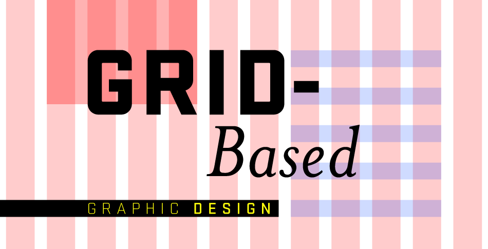
Image result for grid over graphic design

  1. Visual Logic- everything talks to each other
    • Design solutions come together best when the components are interrelated. The relations of type and image should respond to each other visually, and the content organization should respond to the formatting proportions.
  2. Organizational Strategies
    • Figuring out what goes where, in what order, and how it should be arranged from a composition standpoint demands a lot from the designer. Structure and intuition play an important role here in this process, because a client might want content in a particular order but the designer really has to understand the content enough to be able to assess the clarity and conceptual aspects and rearrange it if needed.
  3. The Grid System (confuses me)
    • I understand the concept of using the grid and why, but have not been able to fully understand it to bring these tools to fruition. The benefits of working with a grid are: clarity, efficiency, economy, and continuity. A designer should start here to help distinguish between information and ease a user’s navigation through them.
  4. Nonstructural Design Approaches (my type of approach)
    • The decision to use a grid approach always comes down to the nature of the content in a given project. Sometimes that content has its own internal structure that a grid wont necessarily clarify; sometimes the content needs to ignore structure altogether to evoke the response it needs.
  5. Conceptual Pictorial Illusion
    • Another interesting way of creating compositions is to derive a visual idea from the content and impose it on the page format as a kind of arbitrary structure. It could be an illusory representation of a subject or based on a concept.
  6. Visual Relationships Between Words
    • Getting type to interact with imagery poses a serious problem for many designers. The results of poorly integrated type and image fall into two categories: type that has nothing to do with the images around it and typography that has been so aggressively integrated that it has become an illegible mass of shape.
  7. Positioning Strategies
    • Considers the location of the type relative to the image and the attributes of the image’s outer shape in relation to the format.
  8. Design as a System
    • The vast majority of designed works are systematic in nature; the single-format, one-off design piece is rare. Because of this, a designer’s understanding of the visual language he or she is creating for this work is extremely important.
  9. Formal Variation
    • Once a designer can answer:
      • What are the visual components of this project?
      • What kind of images am I using?
      • Is geometry important in the shapes or relationship?
    • Focusing on one or two of the variables might lead to establishing rules for how these variables might be altered without changing their fundamental character.
  10. Pacing & Sequencing
    • The order in which a designer delivers content can be powerful in creating variation without disturbing the essential logic of the visual language.


Journal #4: the world of IMAGE

“Images are no longer just representations or interpreters of human actions. They have become central to every action that connects humans to each other… as much reference points for information and knowledge as visualizations of human creativity” -Ron Burnett

  1. Abstract & Representation
    • An image will always be a mixture of abstract and representation. Using intrinsic messaging of abstract form can influence a photograph composition’s messaging potential.
  2. Image Modes
    • Mode- the form of an image’s representation
    • A designer might choose to represent an idea by using photographs, illustrations, or a hybrid.
  3. Semiology and Stylization
    • The designers goal is to invent a specific graphic language- an internal logic of positive and negative relationships, an emphasis on curved or angular forms, and an integration of line and mass.
  4. Illustration
    • The choice of illustration over photography opens up tremendous possibility for transmitting information. An illustration can be concrete, objective, or realistic in how it presents it subject.
  5. The Medium is a Message
    • The language of the tool has a powerful effect on an illustration’s communicative value, not just on its visual qualities relative to other elements in a design solution.
  6. Graphic Translation
    • Depicts subjects in a literal way.
  7. Strategies for Composition
    • Designers often forget they are not bound by the realities of arrangement imposed by the scene they are rendering.
  8. Mixing Image Style
    • Creating contrast among visual elements is key to surprising, refreshing, and enlivening layouts.
  9. Narrative Interplay
    • Putting photographs together increases their semantic power and creates narrative or storytelling.
  10. Metaphor
    • A designer may present an image that means something else entirely, refers to a much broader concept, or combines concepts to evoke a third concept that is not explicit in either of the combinations.

Journal #3: choosing & using TYPE

  1. Type Sizes & Spacing
    • Setting type smaller or larger than the optimal reading size for text has an impact on spacing.
  2. Visual Variations
    • Not all viewers will perceive the same associations in a given type face; the designer needs to carefully evaluate the typeface selection in the context of the audience for a particular piece.
  3. Style Classifications
    • Classifying type helps a designer grasp subtle differences between styles, allowing them to select an appropriate typeface for a particular project.
  4. Know the Details
    • Selecting a type face for its feeling or mood is tricky and often comes down to a designers gut reaction to it.
  5. Combining Type Styles
    • A rule of thumb and a good start to mixing typefaces is to select two type families for a given job. It provides a framework for finding a maximum amount of contrast and it forces a designer to exercise some restraint.
  6. Alignment Logic
    • The alignment of the text has an effect on the spacing within it and on the search for desirable text setting.
  7. Type is Visual
    • Type is visual and in space it operates the same way that dots, lines, squares, fields of texture and patterns do in any composition.
  8. Typographic Color
    • Changing the typographic color of the components separates them from the surface and introduces the illusion of spatial depth and a sense of changing rhythm.
  9. The Texture of Language
    • The variation of typography texture- boldness, size, linearity, texture- is a source for typographic color. Approaching typographic material in a sensory way is a powerful method designers can employ in creating a more vivid text experience.
  10. Alignments, Masses, and Voids
    • Visual structure must evolve out of the verbal structure of language. The verbal sense helps define what material within it might be mass or line.

I haven’t really thought about typography, except to choose a font that I really like personally. I always try to choose one that fits the piece though, but its usually one I like and I guarantee that I haven’t thought half of these things through.

Journal #2: color

  1. Hue
    • The identity of a color as a result of how we perceive light being reflected.
  2. Hue Relationships
    • Interaction between hues can be created by the designer. The closer or farther apart they are on the color wheel determines the harmony of the optical qualities.
  3. Saturation
    • Describes a color’s intensity or brilliance. A saturated color is very intense or vibrant. Colors that are dull are desaturated with no visible hue.
  4. Saturation Relationships
    • As a hue is desaturated, it can appear to become darker or cooler adjacent to a different hue of greater saturation.
  5. Value
    • It’s intrinsic darkness or lightness. As the value of a single hue changes. either darker or lighter, its intensity decreases.
  6. Temperature
    • Subjective quality related to experiences, as colors considered warm remind us of heat and colors considered cool remind us of cold objects or environments.
  7. Temperature Relationships
    • It is possible to create relationships within a color palette based on relative temperature.
  8. Color: Form & Space
    • Applying color to a composition will have an immediate effect on hierarchy, the relative order of importance of the forms of space.
  9. Color Psychology
    • With color comes a variety of psychological messages that can be used to influence content. Imagery and verbal meaning alike.
  10. Changing Color, Changing Meaning
    • Because color strongly evokes emotional response, it’s very important that the designer is intentional about it.

I have not done enough graphic design to anticipate how each of these affects my design process, but I can say that overall colors are something that I take seriously. I know that I tend to use anything muted or desaturated, like pastel everything. I like the vintage feel of it. I do know that there are certain times for being intentional about the color as well.

Journal #1: form & space

  1. Clarity & Decisiveness
    • Creating clear, accessible visual messages is something I strive to do with my process.
  2. Plane and Mass
    • I don’t normally play with plane and mass unless with text, if I’m creating a drop shadow. I haven’t had enough experience to play with the dimensions of the design I create.
  3. Surface Activity
    • Textures and patterns I stay away from as well, when done right they can look good but they seem very time consuming and you have to pay close attention to detail.
  4. Static vs. Dynamic
    • We talked about this last week in trying to figure out what makes something static or dynamic. It all comes down to the proportions of positive and negative. The picture plane is already flat, and movement and depth must be created as an illusion.
  5. Breaking Space
    • Space is neutral and inactive until it is broken by a form. Breaking the space means engaging the viewer, and transmitting important messages both literal and conceptual. I’ve never thought about the space as something that needs to be broken, but filled.
  6. Arranging Form
    • Creating relationships among the forms, between the forms and in the surrounding space generates messages for the viewer and between themselves.
  7. Symmetry
    • Asymmetrical arrangements provoke more rigorous involvement, while symmetrical arrangements can cause the viewer to not investigate any further. I don’t really know how this affects my design process because I don’t intentionally play with symmetry or asymmetry but I thought it was interesting.
  8. Activating Space
    • Focusing the majority of visual activity into one area of a composition is an excellent way of creating emphasis and a contrasting area for rest. This can also cause other space to feel inactive.
  9. Proportion
    • This is all about controlling the eye’s movement through, and creating harmonic relationships among form elements.
  10. Identity & Difference
    • Creating comparisons between groupings of form or among parts within a group is identity. I like toying with identity and difference so the components don’t look identical but they look like they belong.

my design process

“If everything is “good“, then nothing really can be.”

Some things I noted from the reading that intrigue me or affect my design process are:

  1. Conceptualizing
    • I definitely think about things in my head before even attempting to do it and I usually make a plan as to how I’m going to do it (also in my head). I rarely draw anything because it feels archaic to draw something like 100 times and do the scene where the artist throws all the crumpled up attempts in the trashcan. It’s 2018, we attempting it on the computer and making changes as we go.
  2. Colors
    • I tend to use the colors I would use if the project were for me. Also, knowing which colors bring out certain moods is imperative to the vibe the project gives off.
  3. Less
    • I’ve never really done anything minimal. It has to have aspects to it that draw your eye. But sometimes minimal is good.
  4. Create
    • Good artists borrow, great artists STEAL. I don’t know who said that but I guess it stuck with me. I’m not the graphic design wizard that can create the image in my head. So I use free pictures from google.
  5. Voice 
    • Treat projects differently depending on the voice of the brand. Making all the parts look equal and in the same language and on the same page is something I’d say I’m good at.
  6. Type 
    • I have never used more than one type of font on a project, I guess the cohesiveness of it is something that I like.
  7. Purpose
    •  Every component on the page should have a purpose or contribute to the overall message.
  8. Measure
    • I usually measure with my eyes to gauge the overall aesthetic quality, if it doesn’t look good then I keep moving.
  9. Universal 
    • When they said “remember  that it’s not about you”, I gasped and dropped my cup. “WHAT?” Just kidding, I wasn’t THAT dramatic. For the most part I know that projects should be universal, but I also think that sometimes people bring things to you to do because of the personal flair that you bring to it. That, of course, is on a case-by-case basis and not to be confused with when people bring specific projects to you to do in their voice/brand.
  10. Squish
    • When I saw the example of the SYDNEY DANCE COMPANY with the squished and also separated text, I realized that this has been very popular recently with “hype churches” and their social media accounts. I thought it was cool, because it gives a very youthful appeal to it.