Hello Class!

Welcome to WordPress. This is your new process journal platform. Hopefully, you will find it easier to use than the discussion forums on Canvas.

To begin, you will need to log in on the left.

Once logged in, you can add a new entry by clicking the ‘New Entry’ link in the left menu bar.

Be sure to hit the ‘Save & Return’ button at the bottom of the screen to save your changes or ‘Publish’ if this is new entry.

Reading Notes p. 6-29

  1. Create something with a message
    • -this influenced me because its before the project is even created. There should be purpose and meaning behind each thing you create.
  2. Choosing the right color
    • this is important to the overall project because it wil depict the right type of message you want to convey. It doesn’t work if the colors are random and just put anywhere.
  3. Type
    • Using fonts and type to be incorporated into your design is crucial to understanding and using your space. often it can be used to support your overall vision
  4. Blank Spaces and how people view it
    • By adding intentional space in your design it can open up the gateway to how people interpret your designs
  5. Creating a design that many people can appreciate
    • by gearing your designs and projects in a way that can be understood by a large audience, you can reach a larger crowd. If its left open for interpretation your design could be used on many levels.
  6. Using symmetry, color, and depth
    • by relying on your own creative strengths you can find new ways to create a message and share an idea. Through different elements that work together you can share an idea in many ways, through various elements.
  7. Avoid being trendy or too close to whats in style
    • This really shifts the way we look at design because although we want to be relevant we also don’t want our designs to be swallowed up by the mass production of whats in style
  8. Being original
    • when designing and working through the process its important to stay close to your own creativity and not copy or replicate what has already been done.
  9. For designs to stand out they must have elements of similar designs but stand on their own
    • for a design to be recognized and have an association with its creator, there should be elements from what is original to the artist and designer
  10. The final product is yours
    • The design should encompass many areas that will keep the audience engaged and also allow for proper interpretation so that there is constant movement and interaction with the design

Reading Notes | Appendices

Reading Notes / Appendices


  1. speak with one visual voice. – to draw attention make it different from everything else surrounding it. If I am going to work on a brand I should be consistent with the colors, typography and forms.
  2. use typefaces maximum. – when working with typefaces I won’t combine two similar fonts. I will use fewer fonts as well. I would use the same font but different style.
  3. Pick colors on purpose – I will choose colors that make sense. Certain colors bring out certain emotions. There are colors that look better next to each other.
  4. negative space is magical- when you add negative space it gives the object in the design more importance. The focus is on the main object.
  5. Be decisive – If you are indecisive your project will always be changing, and you are never going to finish the design. I have to make clear decisions about things like size and color.
  6. look to history but don’t repeat it – I think this is something that stuck out to me because we like certain art and we try to copy it. This is never good to do. You should be inspired by the art but never copy exactly the design of someone else’s.
  7. Symmetry is the ultimate evil – When creating art, it does not matter if your symmetry is equal. When designs are symmetrical it seems repetitive and does not give the design a new perspective.
  8. be universal; it’s not about you – It is important to realize that the art is not about you. Don’t just make things you like. Do what others would like and enjoy. When creating art people should do all kinds of things. You have to create foe everyone else.
  9. Ignore fashion – This can be hard because people want to jump on the latest or popular thing. Try to be steer away from the latest design trends just to relate to an audience. It shows you are not being original. The work will stand out more and people will notice it. Trends come and go and people will not be interested as much in it I think it is important to be a trendsetter and not do what it is the current market.
  10. Squish and separate – When doing this it makes the design livelier and not dull. A designer should be giving art more life. Even if it means moving things around and squishing and separating them. It gets the audience’s attention that the design has density.


Reading Notes #5

Reading Notes: Chapter 5

1)organizational strategies: structure & intuition: By figuring out what goes where, in what order, and how it should be arranged from a compositional standpoint demands a lot from a designer. A designer might have to reorder it when it is necessary to improve its clarity or enhance its conceptual concepts.

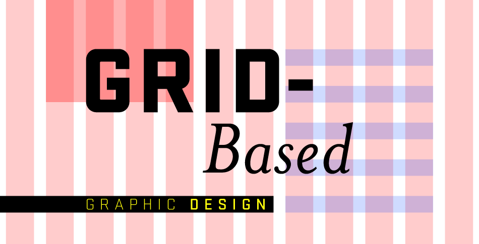
2. structure: the gird system: All the pieces have to come together to communicate. The grids in the image can be organic or loose. A grid helps show a systematic order and helps the user navigate and distinguish items.

3) exploring other options: nonstructural design approaches: It has become the status quo when designing. There are other options of ways to organize images and information. Sometimes there does not need to be structure.

4) grid deconstruction: It is about splitting apart grids and structures. A designer can do this by making putting words and images vertically or horizontally. Even overlapping and putting things in different proportions. It would be put in places where it does not usually go.

5) conceptual or pictorial allusion: This is an interesting way of imposing a visual idea into a page format. It can be an illusory representation of a certain subject or a concept. The word and images that are floating are an example.

6)  visual relationship between words and pictures: There are usually two categories when it comes the relationships. The first category is when there is nothing in common with the images. The second category is when the typography has been integrated with the image that it becomes obscured. It is good to know where the objects will go depending on the lights and darks in the image.

 7) positioning strategies: This is where you have to consider where to position an image and its words. Words are usually placed in a rectangle are part of the image. Its relationship depends on its positioning and elements. It can be placed on, in, or next to a cropped image.

8)integrating silhouettes: They share a visual and opposing relationship with their alignments. The designer should position the silhouetted images with respect to the grid. It should look like it flows smoothly.

9) finding flexibility: There are two variables when it comes to fundamental variables. The first one includes the way the design is presented like its colors and form. The second variable is the frequency of different page components within the palette.

10) pacing & sequencing: This is where the reader will capture what part goes where and what it means. This would be like figuring out the subpage from the homepage within a website. Another example would be a magazine or brochure. Organization is an important element when it comes to structuring the design.

Reading Notes Appendix

  1. Create disharmony to draw attention
    • In my designs, if I am going to use chaos it needs to be for the purpose of drawing the eye to something that is outside of the chaos
  2. Multiple type faces can be used when there is a purpose for it
    • When I am presented with a design opportunity where I need to use multiple fonts, I need to be purposeful in my font choice and look at how all of the fonts work together to communicate my message.
  3. Sometimes it is necessary to pick colors that are unexpected
    • My job is to grab the attention of the audience and being aware of how choosing unexpected colors can grab attention more effectively will allow me to become a more successful designer as I walk through the design process.
  4. Never break the rule of negative space
    • Using negative space is so important that the rule can not be broken.  In my design process, I need to be aware that a good design will always use negative space.
  5. Words do not always need to be involved in the picture
    • Depending on the information being communicated my design may or may not need to have the words directly in contact with the picture.
  6. Type does not always need to be friendly as long as it is communicating your message well
    • Using only friendly designs can hinder the design process by creating a rule that only allows for the expected to be done and hindering new creative expressions.
  7. If squish and separate is not being used then there should be rhythmic movement
    • When I am designing squish and separate is helpful when it used with negative space but if it is not being used there should still be a rhythm and purpose to the design.
  8. Complexity without a clear purpose can become more engaging
    • When there is no clear purpose in the design process, it may cause confusion in the audience which may or may not lead to the audience seeking to find out more in the design.
  9. Mathematical elements can be necessary
    • Using rulers and measurements in the design process is not bad and can be extremely helpful when doing geometric or pattern designs.
  10. Occasionally being trendy can be beneficial
    • When designs are being used for short term purposes or to gain the attention of a particular audience for a season then being trendy can be beneficial for communicating a message.

Appendix Notes

  1. Communicate; don’t decorate
  • Designs are not for just putting images or text on a page, it has to tell something to the people who are going to see your work.
  1. Use two typefaces maximum
  • A change in typeface signifies change in meaning, and if you are trying to send a message having multiple typefaces can divert from the meaning you intend to get across.
  1. Show one thing first
  • If you show your viewer multiple things at once, they could easily become distracted, so space your design out.
  1. Pick colors on purpose
  • Color has its own emotions to them so pick colors to give your audience the emotion you want them to feel.
  1. Negative space is magical
  • Negative space is used to direct your viewer’s eyes to what you deme important to the design, negative space is a handful tool to make your audience pay attention.
  1. Treat type as an image
  • Type is just as important as the images of a design, type can also be used to create images to immerse your viewer into your design.
  1. Be universal; it’s not about you
  • You want to make your design something that many people worldwide would enjoy, not what you alone would enjoy, because then you are just going to get a few people who like your design instead of many.
  1. Measure with your eyes
  • Sometimes going by the rulers won’t make the image symmetrical and you will have to use your eye to be able to determine the proper placement.
  1. Look to history but don’t repeat it
  • You can look to a design in the past to help give you good ideas to design a certain way, but don’t make it exact, because that design has been done before and people wouldn’t take an interest.
  1. Symmetry is the ultimate evil
  • Symmetry offers little movement for your design and it limits you to what you can do.

Reading Notes Appendices


1. The size and shape of space in a picture changes how we perceive form. By changing the size of a format, I can learn to change the apparent size of elements in my design processes.

2. The form of a picture is considered a positive element while the space of the picture is considered negative. By learning the relationships between positive form and negative space, I can convey the appropriate message desired from my designs.

3. The temperature is the subjective quality of colors (ex: red and orange being warm colors). Learning the temperatures of colors can give my images deeper meaning.

4. How different hues interact with each other is called hue relationships. My images can gain a deeper feeling of unity through hue relationships.

5. It can be difficult to select a typeface based on its feeling or mood. Choosing a typeface often boils down to the designer’s gut reaction or the shapes inherent to that style. By learning the mood that corresponds to each typeface, I can control how the viewer will react.

6. Combining typefaces is conventionally used in the work space. The dispenser must choose typefaces with a clear notion of hierarchy. By establishing hierarchy, I can combine typefaces without losing each typefaces meaning.

7. How the medium of an illustration or photo communicates a message to the viewer.

8. How the type of image can change the perceptual filter the viewer associated with the image.

9. Conceptual/Pictorial Allusion: This method of creating compositions stems from deriving a visual idea from the content that is imposed on that page as a kind of arbitrary structure. By using this method, I can give my images an artistic edge.

10. Formal Congruence:  The similarities between type elements and pictorial elements. I can use this to complement various visual and textual elements in my works.

Reading Notes Ch. 5

  1. A grid can be organic
    • In my design process, I want to learn how to use a grid for order but also so I can create organic forms that break out of the grid
  2. The width and height of columns varies based on what the designer believes looks the best
    • As a designer, I need to be aware that as I make changes throughout the design process that if I believe something does not look good it probably does not look good.  When making columns, I need to use creative freedom to make it look appealing to an audience
  3. Grids can be combined to create certain looks
    • The design process needs to include outside of the box thinking where I understand how to combine different grids to serve a particular purpose
  4. Grids guide the placement of images
    • Even if there are no images in place, creating a grid that provides an idea of where images will go allows for more efficiency and can result in a better design.
  5. How columns interact with text and negative space is important
    • Pay attention to how negative space draws attention to certain bodies of text within a grid compared to other bodies of text
  6. Do not let the grid confine the design
    • The grid is a helpful tool to create a platform for the layout but a dull design will be created if you stick to the confinements of the grid.
  7. Rearranging the position of information can create an unexpected connection between two pieces of information
    • The design process needs to include placing information in unexpected places with unexpected layouts if it will help to communicate the information more efficiently
  8. Text can be laid out to reflect a particular item or concept
    • Grids are a helpful tool but text can also be laid out in unique ways that completely break the outline of the grid
  9. Be careful when combining text and images
    • I need to make sure that when I am using text on an image that it is complimenting the message the image is portraying
  10. Square images limit text to either being a part of the image, separate from the image, or a mixture of both
    • I need to understand that when I integrate text with a square image that where I place the text communicates different messages.

Reading Notes Ch 5

1.  Structure and Intuition

  • Figuring out what goes where, in what order, and how it should be arranged from a compositional standpoint.

2. The Grid System

  • A grid is one approach to achieve solving the problem of organizational placements of pictures, text, headlines, and data.

3. Column Grid

  • Information that is discontinuous from being organized into an arrangement of vertical columns.  Allows the designer to accommodate unusual breaks in text or images on the page.

4. Modular Grid

  • A column grid with a large number of horizontal flow lines that subdivide the columns in rows, creating a matrix of cells.

5. Grid Development

  • Building an appropriate grid for a publication involves assessing the shape and volume of the content rather than trying to assign grid spaces arbitrarily.

6. Grid by Image

  • A grid might be defined by image content through comparison of its proportions.

7. Grid by Text

  • The designer might approach the grid from perspective of the text shape and volume.

8. Column Logic and Rhythm on a Grid

  • The way in which columns of text interact with negative space is an important aspect of how a grid is articulated.  The spaces above and below columns play an active part giving the columns a rhythm as they relate to each other across pages and spreads.

9. Variation and Violation

  • The greatest danger in using grid is to succumb to its regularity, the grid is an invisible guide existing on the bottommost level of the layout.

10. Spontaneous Optical Composition

  • The compositional method is purposeful intuitive placement of material based on its formal aspects seeing the inherent visual relationships and contrasts within the material and making connections for the viewer based on those relationships.

journal #5: putting it all together

“Begin with the end in mind” -Lana Rigsby

Image result for grid over graphic design

  1. Visual Logic- everything talks to each other
    • Design solutions come together best when the components are interrelated. The relations of type and image should respond to each other visually, and the content organization should respond to the formatting proportions.
  2. Organizational Strategies
    • Figuring out what goes where, in what order, and how it should be arranged from a composition standpoint demands a lot from the designer. Structure and intuition play an important role here in this process, because a client might want content in a particular order but the designer really has to understand the content enough to be able to assess the clarity and conceptual aspects and rearrange it if needed.
  3. The Grid System (confuses me)
    • I understand the concept of using the grid and why, but have not been able to fully understand it to bring these tools to fruition. The benefits of working with a grid are: clarity, efficiency, economy, and continuity. A designer should start here to help distinguish between information and ease a user’s navigation through them.
  4. Nonstructural Design Approaches (my type of approach)
    • The decision to use a grid approach always comes down to the nature of the content in a given project. Sometimes that content has its own internal structure that a grid wont necessarily clarify; sometimes the content needs to ignore structure altogether to evoke the response it needs.
  5. Conceptual Pictorial Illusion
    • Another interesting way of creating compositions is to derive a visual idea from the content and impose it on the page format as a kind of arbitrary structure. It could be an illusory representation of a subject or based on a concept.
  6. Visual Relationships Between Words
    • Getting type to interact with imagery poses a serious problem for many designers. The results of poorly integrated type and image fall into two categories: type that has nothing to do with the images around it and typography that has been so aggressively integrated that it has become an illegible mass of shape.
  7. Positioning Strategies
    • Considers the location of the type relative to the image and the attributes of the image’s outer shape in relation to the format.
  8. Design as a System
    • The vast majority of designed works are systematic in nature; the single-format, one-off design piece is rare. Because of this, a designer’s understanding of the visual language he or she is creating for this work is extremely important.
  9. Formal Variation
    • Once a designer can answer:
      • What are the visual components of this project?
      • What kind of images am I using?
      • Is geometry important in the shapes or relationship?
    • Focusing on one or two of the variables might lead to establishing rules for how these variables might be altered without changing their fundamental character.
  10. Pacing & Sequencing
    • The order in which a designer delivers content can be powerful in creating variation without disturbing the essential logic of the visual language.