In my photoshoot at Fashion Island, I focused my attention to the aesthetics that I am attracted to. I enjoy sitting at the koi pond, listening to the water, and watching the children look at the fish, it makes me feel relaxed. I took a friend because I felt awkward there by myself and wanted to capture how one can enjoy the surroundings within Fashion Island. I also focused on the shapes that were present in designs (the way that the light came through the awnings, the arcs of the water, and the tiles in the steps).
Journal 4-disbelief
After I looked through all of the different emotion words, chose disbelief because I currently am in disbelief that I will be graduating soon. I pulled apart “dis” and “belief” to further show how it can alienate you from things around you, or how it makes you feel in relation to your surroundings. I cut up dis using the knife tool for the continuity of this idea. Having “dis” and “belief” stretching to reconnect but still having a space between them allows the mind to have to stop and really look to see how close they are. I took “lie out and made the letters a little hollower because when there is disbelief, there is a chance that we know that there is a lie within whatever we are observing and we focus on that “lie” even if it is not real.
Type poster-foil letter
I used the whole roll of foil and wanted to throw the whole thing away at least three times. I started off by making a long strip and folding it to be very thin and flat. After I did this, I ripped it and wanted to not finish the project. I walked away for a few days to be able to come back with a new vision and renewed patience. I started off by thinking of what kind of font would be “unique” to me. I went with my initials that I use in my signature (easy enough for me, I have all M’s). I took a piece of paper and drew out my M and began to crush the foil and place it onto the paper shape. I wanted to make it all one shape, but running out of material made the decision to keep them separate easy. I decided to keep the letter bold because it stands for all three of my initials. In breaking down the color, I started off the tail with animal print. I thought this was comical but also showed the movement of this first segment of the letter. From there, the colors flow into a lighter blue with a sky gradient. The layout gives the eye a direction up the leg and into the middle element. At the top of the middle, there are different colors, but they are lighter on the left side, following the sky feel, and darker on the right, hinting at the rigidity that will soon follow. The last leg has different pattern alluding to the different pattern of the letters that will follow (for example, iranda, ichelle, or ayer).
History essay
I enjoyed researching and getting to know the style and images Erik Nitsche. When I was looking for photos that I could recreate, I was inspired and in awe of how easy to understand, but how hard to recreate his work was. His work was in a way whimsical but still functional. Within the design, there was a sense of respect for the message that was being conveyed while transforming the subject into something new. This inspired me for our identity design. I wanted to keep the designs functional while making the observer have to think about the design.
The Foil

This project of creating foil into a design piece was the most challenging for me. I did not want to do something typical and I also wanted to push myself a little away for my love of black and white design colors. So I picked colors I liked and pieced together this project. It is one of my favorite projects of this whole class.
Inspiration Boards
Sometimes as creatives, we have some trouble creating content. When I need some extra help with a project, I look for some insipration to get my brain juices going. One of the websites I highly recommend for inspiration is The Inspiration Grid. This site has a collection of typography designs, photography, logo design, etc. 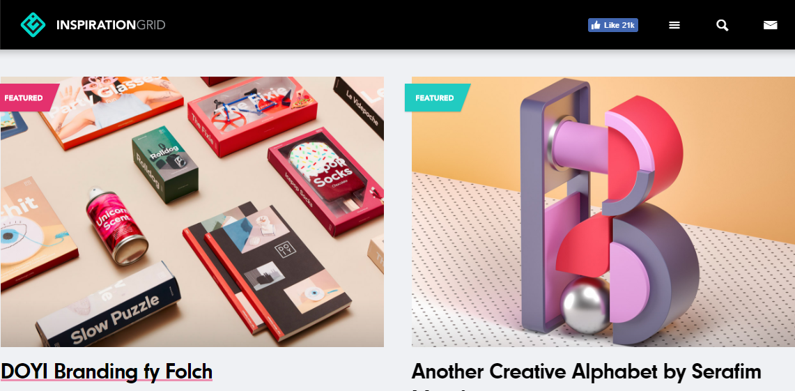
The Key
One of the media accounts I follow that inspires me the most is The Giving Key company. The mix creativity with compassion for others. When I look at their Instagram and website I am inpired both creativitly and personally.

https://www.instagram.com/thegivingkeys/?hl=en

The Inspiration

My go to website now and forever will probably be Designspiration. It inspires me to think outside the box and expand my design knowledge. I love being apart of such a creative generation and looking at the work people are creating.
ANDREW BAFFA
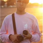
This man is another inspirational photographer and I’m lucky enough the I get to be his roomate.
https://www.andrewbaffa.com/
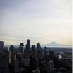
EMILE HUSSELL
For my photo project and photography in general, Emile Hussell is one of my main inspirations. His color choices and eye of stunning images inspires me personally.
http://emilehussell.tumblr.com/