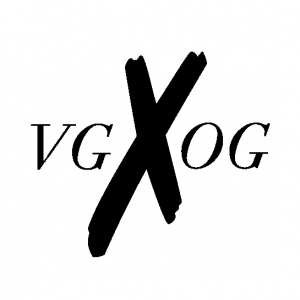
Vanguard Originals is inspiring to me because it is a clothing brand that was created by musicians and other creatives . Their out of the box styles and graphics on their clothing stands out from the rest of its competitors.
http://www.vgxog.com/
Vanguard Originals is inspiring to me because it is a clothing brand that was created by musicians and other creatives . Their out of the box styles and graphics on their clothing stands out from the rest of its competitors.
http://www.vgxog.com/
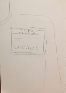
This was my orignal concept for my book cover. I got a lot of feedback telling me to go with this sketch but I just didn’t feel connected to this concept. I want to do something that was more my style but that also stretched my creativity…
So after a lot of thinking and staring at a blank Indesign page I came up with a concept I really liked and that conncected to my style but also really, really challenged me.

Jonathan Faust is a magician with typography and caligraphy. He post videos and images on his instagram of his work in typography. His work inspired a lot of the choices I made in typography
http://www.jonathanfaust.com/
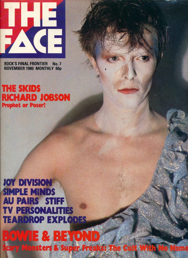
I did a magazine from the 1980s called The Face for my design history essay at the beginning of the semester. I loved the style of the covers and the style of photography. The magazine was so raw and real.

I made a replica of the magazine but using present day people and films. It was amazing to make something like that and be creative with the pictures and news we have today.

I love the style of text overlapping and simplistic colors. My mood board for my book cover really embodied those two styles. I have stretched myself to add more color but clack and white will always be my favorite go to colors.
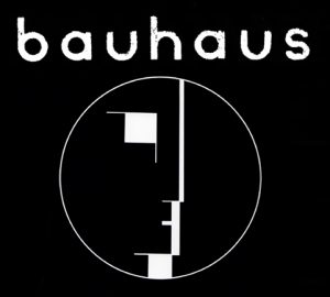
In my submission for the letter project that we did, I based mine on this album cover. This is actually a record that I have and listen to regularly back home.
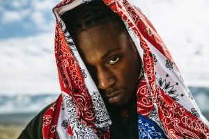
An inspiring figure in whatever he does musically, visually, and throughout the world. He is a very smart, young man that can hopefully make a big difference in years to come.
Dev Hynes. The aesthetic flowing through his art, music, and dance is something that people do not come across very often. It is unusual when compared to other artists, but is also unique and meaningful to his style as an artist. He creates depth behind what he does with his music, and gives the viewer a full experience visually and audibly.
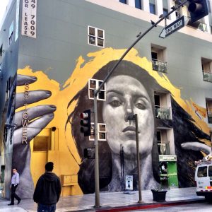
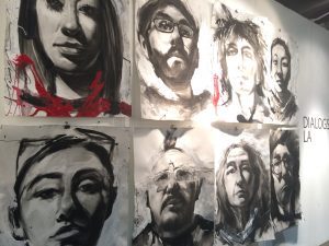
Robert Vargas, another visual artist that inspires me to be different. Shows how much art done by hand rather than digitally can attract the eye.
![]()
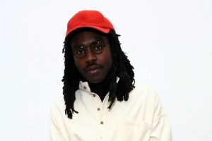
LVRN is a record label based in Atlanta, Georgia. The music released by this label and aesthetic of the label appeals to me.